Bringing flexibility to life for O2’s game-changing tariff
O2 was about to launch something big: a tariff that let customers change their phone whenever they wanted — a radical shift from the traditional mobile plan. But how do you get people to understand and feel that kind of flexibility in just a glance? The brief was clear: Create a campaign that’s as fluid, dynamic, and future-ready as the product itself.
What we did!
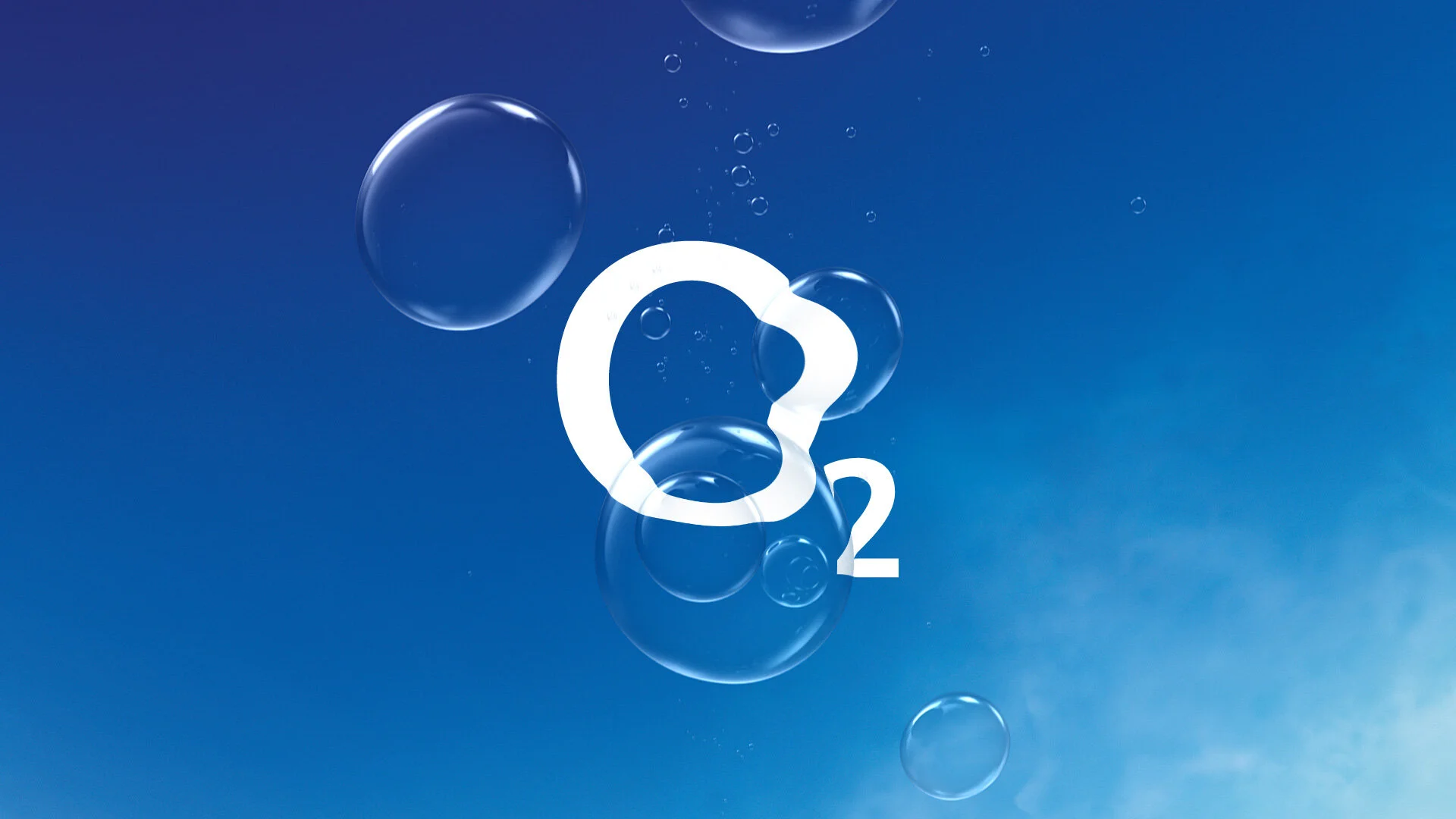
Exploratory sessions, big thinking, and loads of concepts. Some felt clear but boring. Others felt exciting but hard to follow. The sweet spot? A single, ever-morphing substance — a shapeshifter that could symbolise the flexibility of the Refresh tariff in motion.Early tests with focus groups confirmed it: The morphing visual was fresh, understandable, and made the product’s promise feel tangible.
The rollout
With the concept locked, we went big.
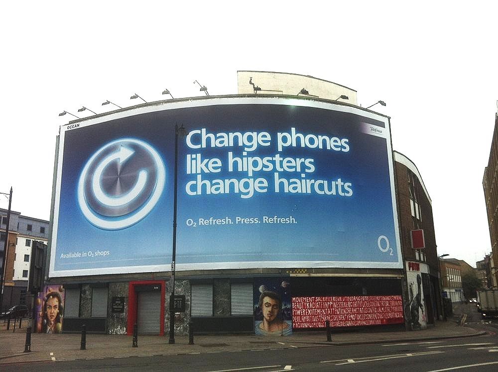
• TV
• Digital
• Print
• Outdoor
• In-store
A single visual system carried across every channel, flexing just like the product it represented. The result?
• Major lift in brand awareness
• Surge in Refresh subscriptions — well above forecast
• Clear campaign recognition and retention
Why it worked
It wasn’t just clever — it was cohesive.A single, elegant metaphor turned a complex tariff into something emotionally resonant and visually memorable.
Behind the scenes
I led creative development and testing, from blank page to full campaign ecosystem. But it was this project that shifted my focus entirely. I fell in love with the product — the tariff itself — more than the campaign. It sparked a new direction: from selling things to shaping them.


Learn more
Want to see how we turned a flexible phone plan into a flexible visual story?
Drop me your email and I’ll send you the full breakdown 🔁📱✨