Fixing the foundations
Kia didn’t just have a perception problem. It had a structural one.Internally, a new digital design had been developed with strong creative ambition. But once it moved beyond concept, the cracks became visible. Engagement wasn’t improving. Usability concerns were surfacing. And there was a growing risk that the experience — particularly across key product pages — would begin to impact business performance.
Regional leadership made a smart call: before scaling further, test it properly.The question became clear.How do we create a more cohesive, intuitive, and accessible experience for Kia customers — without losing the creative intent?
Starting with evidence, not opinion
Rather than critiquing from the sidelines, I built a research-driven evaluation. We began internally. Through stakeholder interviews with product managers, designers, and developers, I unpacked the original intent behind the design decisions. What were they trying to solve? What constraints were they operating under? Where were compromises made?
Then we moved to users.Interactive prototypes allowed us to test the experience without committing to full development. We ran scenario-based usability sessions, observing how real customers navigated key tasks — particularly around car exploration and comparison. Follow-up conversations dug deeper into buying behaviours, revealing how customers actually approach automotive research online.
Alongside qualitative testing, I conducted a systematic usability evaluation. Tree testing, first-click analysis, and heat mapping validated patterns we were observing. This wasn’t subjective preference. It was measurable friction.
What we uncovered
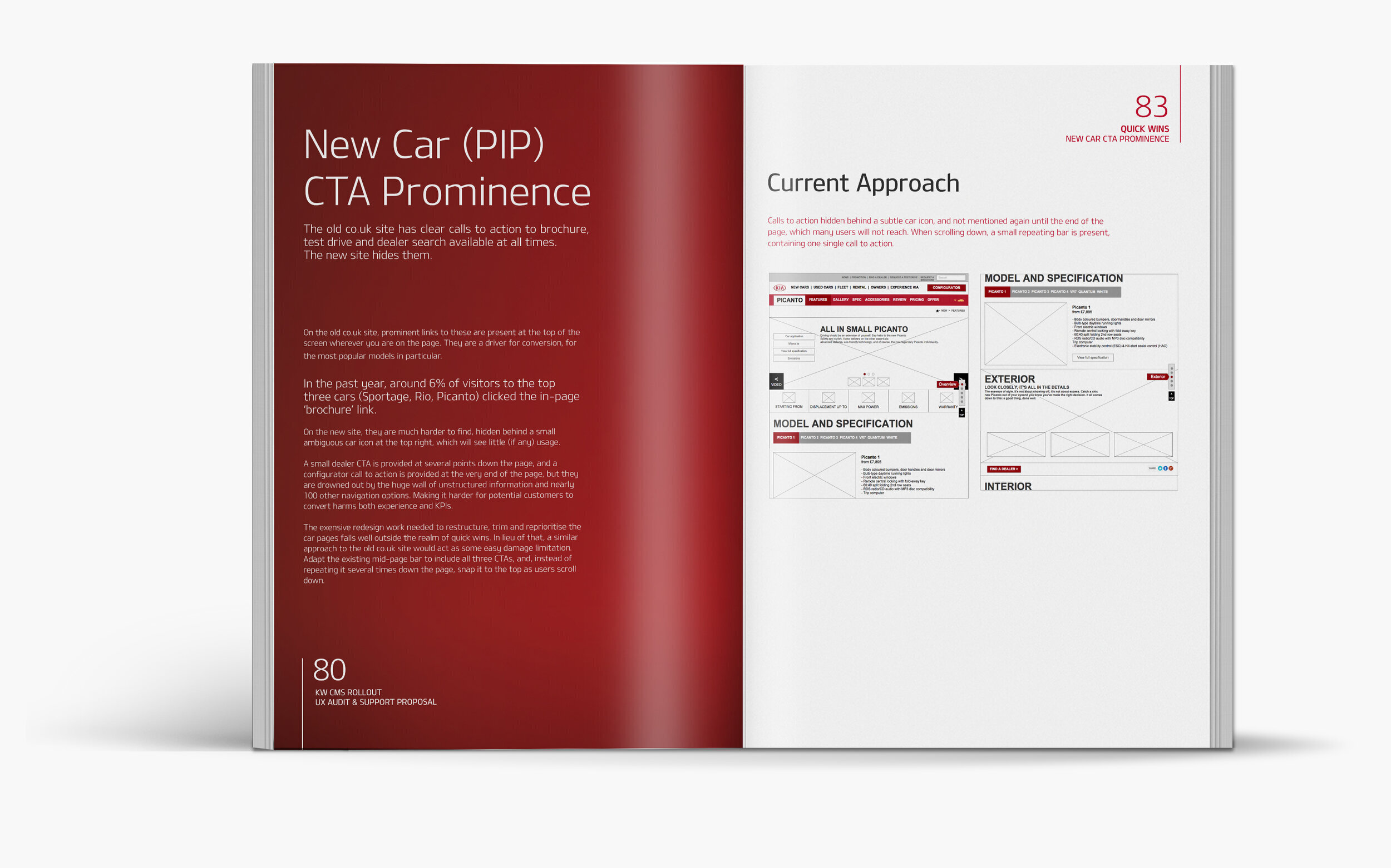
The findings were clear — and uncomfortable.The redesign hadn’t solved existing issues. In several cases, it had amplified them.Navigation had become excessively complex. On some car information pages, over 100 possible routes existed within a single feature area. Multiple navigation systems coexisted on the same page. Taxonomy was inconsistent and, in places, incorrect. Some journeys stacked five levels deep. Users struggled to form a mental model of the site. Confusion led to early task abandonment.
The car information pages (PIP) were particularly problematic. Originally conceived as a narrative-driven single-page journey, they assumed users would read from top to bottom. In reality, most scanned. The design did not align with real behaviour. Later iterations had added more navigational layers, diluting the original concept while increasing complexity.
Content clutter compounded the issue. Low-value information — better suited for internal documentation — competed with key product messaging. Inconsistent UI behaviour and terminology further eroded trust.
Accessibility standards were not consistently met, risking exclusion of users and potential regulatory exposure. Creativity wasn’t the problem. Architecture was.
Designing clarity back into the system
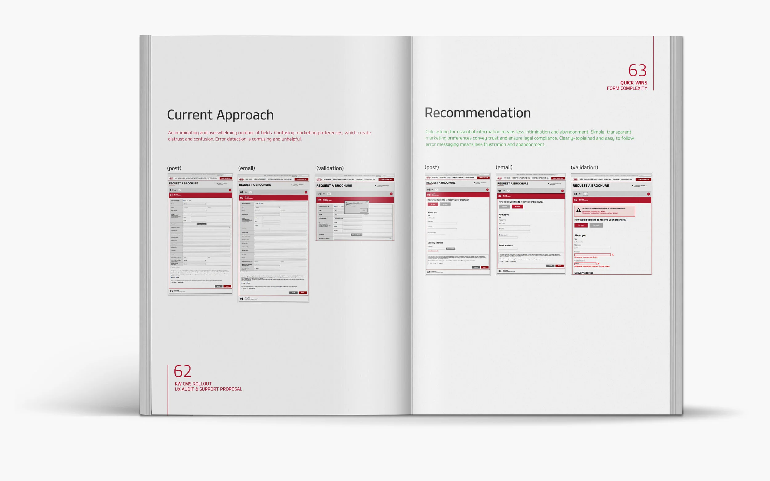
The solution required more than visual refinement. It required structural correction. Navigation was rebuilt around a simplified hierarchy, dramatically reducing on-page route options and clarifying taxonomy. Prototypes of the revised structure showed immediate improvements in task completion and orientation. Users were able to build a clear mental model quickly.
Consistency was restored through standardised templates and rationalised UI behaviours. Terminology was aligned. Interaction patterns became predictable. Recognition replaced hesitation. Content was audited rigorously. Low-value material was removed or relocated, allowing product messaging to breathe. The PIP experience was redesigned to support both scanners and deep readers — introducing modular sections, clear anchors, and flexible pathways that aligned with real user behaviour rather than assumed reading patterns.
Accessibility gaps were addressed systematically to ensure inclusivity and compliance.
Each change was prototyped, tested, refined, and validated before recommendation.
Managing internal friction
Not everyone welcomed the scrutiny at first. Having external research surface structural issues can feel confrontational. But evidence changes conversations. When the findings were presented — clearly documented, data-backed, and tied to user behaviour — the internal team shifted from defensive to collaborative. The focus moved from protecting work to improving outcomes. That alignment was as important as the design improvements themselves.
The outcome
The final recommendations provided Kia with a clear, actionable roadmap: simplified navigation, consistent systems, improved accessibility, and user-aligned content structures. Once implemented, the experience demonstrated higher usability, stronger engagement, and improved user satisfaction. More importantly, it laid a stable foundation for future product launches and campaigns.
This project reinforced a fundamental principle: design problems rarely live in aesthetics alone. They live in architecture, systems, and assumptions about behaviour.
When you fix the foundations, perception and performance follow.